In today's media class we continued to talk about postmodernism and how nowadays media texts can be seen as postmodern. Today we were discussing postmodernism in album covers and looking at some postmodern album covers. I thought I would post this to my blog and later I could compare and contrast some of these postmodern covers with my own album artwork.
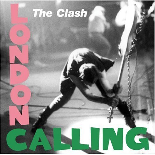
The Clash - London Calling
Firstly this album cover is very traditional when looking for the conventions of an album cover. The album art has the typical album name, artist/band name and a main image that you would expect to find on any album cover.
The main image is of a man, the lead artist, smashing a guitar on the floor. This shows a sense of rebelliousness and aggression. It is also a stereotypical image that we associate with the rock genre, smashing instruments and objects to pieces. The shot also looks in action/in motion, we know exactly how the image would turn out if it were a movie still a few seconds later. This shows the energy coming from the image and the blurring effect also adds to the illusion that the image is in motion. The image is also in black and white which gives us that feeling that the album is serious and also not entirely happy, we also feel the conviction and the classic feel to the past from the image not being in colour.
The font is a complete contrast to the image. For a start the font is colourful, bubbly, loud and playful compared to the seriousness of the image. The image and the font together is a juxtaposition. This use of juxtaposition pulls the audience in and holds their attention, once you look at the cover it is difficult to look away from it as it is so involving.
This album cover is different to any album cover I have come across however what makes it postmodern is the fact that it is a homage of Elvis Presley's first album.
Elvis Presley - Elvis Presley
As you can see both album covers are pretty much the same apart from the obvious changes made to the album cover and main image. The reason this is a homage of Elvis Presley's first album is because of the seriousness of the photo and the layout of The Clash's artwork. They are not mocking the original album artwork idea they are simply celebrating the original text.