

Monday, 8 November 2010
Album Artwork Analysis - Nirvana - Nevermind

At the time this album cover was unique as it showed a very bold message in the simplicity of the one image. Many codes and conventions are found in this album cover, here are some.
Codes used in this album cover are:
- The baby is code for new life and a sense of freedom and innocence. The baby also represents simplicity and purity. The purity is also achieved as the baby is untouched, naked, it is a new born. It plays on the thought that the baby is free but not free from American consumerism.
- The money represents wealth, materialism, gambling and chances we take in life. The money is a dollar bill which makes the audience aware it is about American consumerism. The dollar is attached to a fishing hook which represents use, the consumer, chasing money and 'consuming it', hence it being attached to a hook like fishing bait.- The open ocean represents freedom and the very blue water represents happiness and clarity. This could represent the happiness people feel when they have money and unknowingly are consumed by the music industry.
The 'Nevermind' album title looks as though it too is underwater. The letters are very uneven and not the same in size. The title looks as though it is swimming in the ocean.
The 'Nirvana' band title is very simple and stretched out. The font looks very sophisticated and elegant, for example the 'R' is slightly looping giving it pride and elegance. This is giving the impression that they are not impressed with the American money and society and like to stand tall and look down on it. We can gather from the title that Nirvana have a very clear political ideology on America and believe that American consumerism has gone too far.
The black font used in both titles is code for simplicity and also death and horror. The black colour also could represent their hatred against the American consumerism and how much they want it to be changed.
Album Artwork Analysis - The Beatles - Sergeant Peppers Lonely Hearts Club Band
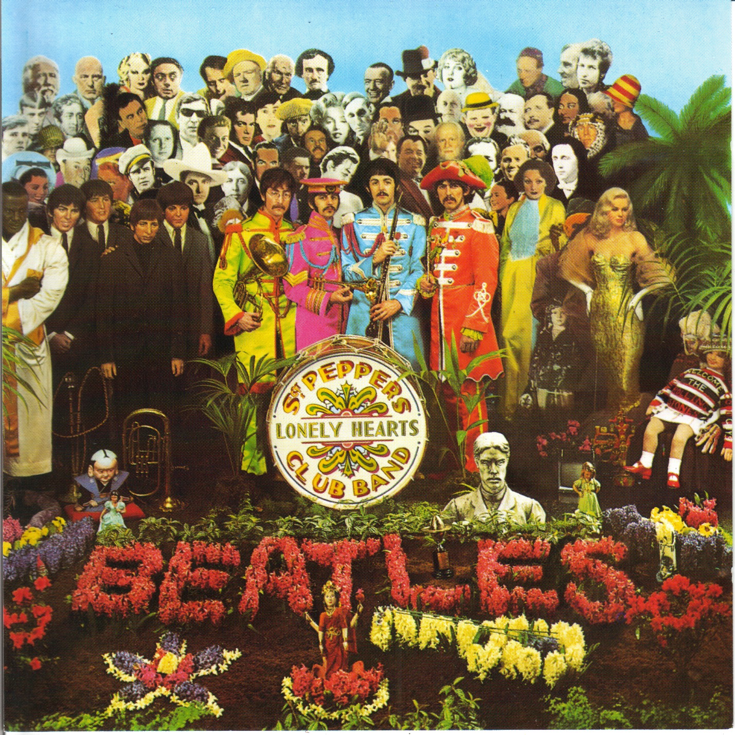
At the time this album cover was revolutionary. It was full of new ideas, it was unique/original and iconic. The artist, Peter Blake, who produced this album cover was a Pop Artist, The Pop Art movement was a popular culture to high art. Peter Blake and The Beatles wanted the album cover to be a piece of art.
Codes used in this album cover include:
- Flowers are code for peace, the hippy scene and love, this is how they wanted their audience to percieve them
- Drum situated in the middle of the cover highlights its importance. The drum is obvious code for music, and also the circus. The circus also has codes for example when people think of the circus they think of it as fun, crazy, colourful and entertaining
- The band are wearing costume that are very circus like, they are in a way iconic and look like military uniform. However the bright colours on their costumes almost make it look like they are making a parody of the military uniform
- Famous people in the background. All the people standing behind the band are legends. By situating the Beatles in the center foreground they are telling us that they have or like to establish themselves as one of the most iconic legends in history. A slight sense of arrogance may be seen from this album cover however I believe they want to show their confidence and belief rather than express their arrogance
- The blue sky is code for freedom and space, happiness, fun, summer and hope for the future.
- The palm tree is exotic and was possible placed on the album cover to say they have 'broken away from Britain' and gig around the world.
- The island they are all standing on is code for them being separate from the rest of use. As if to say that this is a legendary island and only legends are allowed to be on the island. This can also be seen as arrogant however I believe they wanted to simply express their success through their album artwork
Why Use Album Artwork?
Album artwork is used by artists and bands for many different reasons. These reasons are:
- To represent the artist/band
- To stand out and be eye-catching
- Enhance profit
- Used to advertise the contents
- Tries to draw the audience in
- Establishes album/artist and the music genre
- Acts as a selling tool. Art looks nice and can be used as a persuasive device
- Shows the creativity and originality of the artist
- Shows the credibility and artistic merit of the artist, art becomes the icon
All these reasons are achieved by using codes and conventions to communicate with the audience. When I come to creating my own album artwork I need to insure I am aware of all the typical conventions found on them. I researched album artwork and found that these are the typical features of an album cover:
- Name of artist/band
- Title of the album
- Band logo or recognisable symbol of the artist/band
- Special features
- Another image underneath the text
- Barcode
- Record label
- Year of publishing
- Copyright information
- Individual track writers, composers, engineers, producers
- A reference number
- Band members
- Guest performers
- Title of album
- Record label
- Reference number
- To represent the artist/band
- To stand out and be eye-catching
- Enhance profit
- Used to advertise the contents
- Tries to draw the audience in
- Establishes album/artist and the music genre
- Acts as a selling tool. Art looks nice and can be used as a persuasive device
- Shows the creativity and originality of the artist
- Shows the credibility and artistic merit of the artist, art becomes the icon
All these reasons are achieved by using codes and conventions to communicate with the audience. When I come to creating my own album artwork I need to insure I am aware of all the typical conventions found on them. I researched album artwork and found that these are the typical features of an album cover:
Front
- Main image- Name of artist/band
- Title of the album
- Band logo or recognisable symbol of the artist/band
Back
- Track list- Special features
- Another image underneath the text
Institutional Information
- Price- Barcode
- Record label
- Year of publishing
- Copyright information
- Individual track writers, composers, engineers, producers
- A reference number
- Band members
- Guest performers
Spine
- Name of artist/band- Title of album
- Record label
- Reference number
Subscribe to:
Comments (Atom)